Outline meaning in art refers to the line that defines the outer boundary of a subject, separating it from the surrounding space. Every shape you see in a drawing, painting, or illustration exists because something defined its edge. That defining mark — deliberate, expressive, and loaded with intention — is the outline meaning in art.
Strip away color, texture, and shading from any masterpiece, and what remains? The outline. It’s the skeleton beneath every great work of art, the first mark and the last decision, the difference between a subject that commands attention and one that disappears into the background.
From Lascaux cave walls to modern digital art outlines, this fundamental art concept has driven every major visual tradition in history. Outline in art isn’t a beginner’s stepping stone — it’s the foundation every master returns to, the silent force shaping how viewers read, feel, and remember what they see.
What Is Outline Meaning in Art? (The Definition That Actually Makes Sense)
outline meaning in art refers to the line that defines the outer edge of a shape or form, separating it from the space around it. It’s the boundary between an object and everything else in a composition.
But here’s what most definitions miss: an outline isn’t just a border you trace around something. It’s a decision. Every time you draw one, you’re telling the viewer’s brain, “This thing exists. This is where it begins and ends.”
The human eye is wired to follow edges. It’s why we can identify a silhouette in art even with zero internal detail — why a child’s stick figure reads as a person, and why a single brushstroke can suggest an entire mountain. The outline taps into something deeply neurological.
“Drawing is not what you see, but what you must make others see.” — Edgar Degas
The Art Outline Definition: Breaking It Down Further
There are actually two ways to think about what is an outline in art:
- Outline as a mark — a physical line drawn on the surface that traces the external boundary of a subject
- Outline as a concept — the perceived edge of any form, which can exist even without a literal drawn line (implied by contrast, value change, or color shift)
This distinction matters more than most beginner guides admit. It’s the difference between painting and drawing, between a Rembrandt portrait and a Matisse cutout — both use the idea of outline, but in wildly different ways.
Key fact: The word “outline” comes from the Italian profilo and French contour, both meaning “profile” or “boundary.” Renaissance artists used it to describe the outer limits of a figure — and the concept hasn’t changed since.
ALSO READ: WYF Meaning in Text — What Does WYF Really Stand For in 2026?
A History of Outline in Art — From Cave Walls to Digital Screens
The outline drawing is humanity’s oldest visual language.
Prehistoric Origins
Around 30,000 BCE, humans crept into the Chauvet Cave in southern France and drew animals on rock walls. No shading. No color mixing. Just outlines. The lions, rhinos, and horses they drew are recognizable today because the outline works — it always has.
At Lascaux (~17,000 BCE), the same principle appears at an even more sophisticated level. Artists used the natural contours of the cave walls to enhance their outline drawings, turning rock bumps into muscle and curves into movement. They weren’t just drawing outlines. They were using them.
Ancient Civilizations and Outline as Visual Language
Egyptian hieroglyphic art turned the outline into a hieratic tool — a system of rules. Figures were drawn in strict profile (head and legs sideways, shoulders and eyes forward) and outlined in precise, unwavering lines. The art outline definition here wasn’t aesthetic; it was functional. The outline told you who someone was, their social rank, their role.
Greek vase painters of the 6th and 5th centuries BCE developed two major outline-driven techniques:
| Technique | Description | Period |
|---|---|---|
| Black-figure | Black silhouette figures on red clay; details incised through | ~620–480 BCE |
| Red-figure | Red figures on black background; outlines painted, interior drawn | ~530–300 BCE |
Both techniques depended entirely on line art and crisp outline drawing for their power. No gradients. No blending. Just the line.
In East Asia, Chinese ink painters developed the concept of baimiao — “white drawing” — a style using only brushed outlines with no color or shading whatsoever. It demanded extraordinary control over line weight and gestural precision. A wobbling line wasn’t just ugly; it was philosophically wrong.
Renaissance to Baroque — When Artists Started Breaking the Rules
Here’s where things get interesting. Renaissance masters didn’t just use outlines — some of them deliberately destroyed them.
Leonardo da Vinci’s sfumato technique (literally “smoky”) blurred and dissolved the hard outline, replacing it with gradual tonal transitions. His portraits feel alive partly because the edges are lost. The Mona Lisa has no hard outline around her face. That was radical in 1503.
Meanwhile, Albrecht Dürer went the opposite direction. His engravings are a masterclass in expressive outline and controlled line work in art — every edge precise, every line intentional. Two contemporaries, two completely different philosophies about the same element.
Modern Era — The Outline Becomes Personal
By the 19th and 20th centuries, artists stopped asking “how do I draw an outline correctly?” and started asking “what can an outline say?”
- Art Nouveau (Mucha, Klimt) glorified the decorative, sinuous outline — making the line itself beautiful
- Expressionism (Schiele, Kirchner) weaponized jagged, unstable outlines to project anxiety and raw emotion
- Pop Art (Lichtenstein) borrowed thick commercial outlines from comic printing and turned them into fine art commentary
And today? Digital art outlines have made this ancient concept more relevant than ever. Vector graphics, character design pipelines, UI icons — they all live and die by the quality of their lines.
Outline as an Element of Art — Where It Actually Lives
A quick clarification that most guides fumble: outline is not one of the seven elements of art. Line is. Outline is a specific application of line.
Here are the elements of art for reference:
- Line
- Shape
- Form
- Space
- Color
- Value
- Texture
The relationship works like this:
Line → creates Outline → defines Shape → implies Form → occupies Space
Every element downstream depends on the decisions made at the line level. Weaken your outline and your shapes soften. Lose your shapes and your forms collapse. It’s a cascade — and it starts with the mark you make at the edge.
This is why art fundamentals courses always start with line. It’s not arbitrary. It’s architectural.
Types of Outlines in Art — The Full Breakdown
Not all outlines are created equal. Knowing which type to use — and when — is what separates intentional artists from accidental ones.
| Type | What It Is | Best Used For |
|---|---|---|
| Geometric outline | Hard, precise, mathematically clean lines | Architecture, graphic design, technical illustration |
| Organic outline | Flowing, irregular, naturalistic edges | Figures, botanicals, natural forms |
| Implied outline | No line drawn — edge suggested by value or color contrast | Impressionism, painterly realism |
| Lost-and-found outline | Line appears and disappears intentionally | Academic realism, atmospheric painting |
| Gestural outline | Loose, expressive, energy over accuracy | Life drawing, expressionism, gesture drawing |
| Symbolic outline | Stylized and culturally coded | Iconography, religious art, folk traditions |
| Broken outline | Deliberately interrupted line creating visual tension | Graphic illustration, contemporary design |
| Digital outline | Pixel-precise or anti-aliased edge | Concept art, character design, UI |
Geometric vs. Organic — The Core Divide
Geometric outlines feel controlled, rational, and modern. Think product design, logos, and architectural blueprints. The lines don’t waver.
Organic outlines breathe. They curve and vary in a way that feels natural, alive, imperfect. Think figure drawing, botanical illustration, or any representation of the natural world.
The Implied Outline — Art’s Best Kept Secret
Here’s a concept that changes how you see painting: you can suggest an outline meaning in art without drawing one at all. Place a dark shape against a light background and the edge appears — even though no line exists.
Impressionist painters like Monet understood this deeply. They never outlined their figures. Instead, they placed warm colors against cool ones, light values against dark, and let the contrast do the work.
This is called an implied outline — and it’s one of the most sophisticated tools in any artist’s kit.
Outline vs. Contour Line — Ending the Confusion for Good
This is one of the most searched questions in art education, and most answers are muddy. Here’s the clean version:
- Outline = only the external boundary of a shape — the silhouette
- Contour line = traces all edges, both exterior and interior — the topography of a form
The simplest analogy: An outline is the silhouette of a person standing in front of a window. A contour line is a map of every fold in their jacket, every knuckle on their hand, every crease around their eyes.
Both are forms of line drawing techniques, but they describe entirely different amounts of information.
Contour Drawing — The Exercise That Changes Everything
Blind contour drawing is the most assigned exercise in art schools worldwide. Here’s why it works:
- You fix your eyes on your subject (a hand, a shoe, a face)
- You draw without looking at your paper
- You never lift the pen
The result looks chaotic. It always does. But the process forces your eye to slow down and actually observe edges — not the idea of edges, but the real, specific, irregular edges of the real world. It’s the fastest way to break the habit of drawing what you think something looks like instead of what it actually looks like.
Continuous line drawing takes this further — you draw the entire subject without lifting the pen, but you can look at your paper. This builds line confidence and teaches you to commit to marks rather than second-guess them.
There’s also a third term that often goes unmentioned: cross-contour lines. These are lines that travel across the surface of a form (rather than along its edge), suggesting the three-dimensional topography of the subject — like the latitude lines on a globe.
Line Weight — The Secret Variable That Transforms an Outline
Line weight is the variation in thickness within a line or between lines. It’s the single most ignored concept in beginner drawing techniques — and the single most important one in professional work.
Here’s what line weight communicates:
| Line Weight | Visual Effect | Emotional Effect |
|---|---|---|
| Thick | Proximity, dominance, mass | Bold, heavy, assertive |
| Thin | Distance, delicacy, detail | Fragile, airy, refined |
| Varied | Depth, dimension, life | Dynamic, natural, skilled |
| Uniform | Flatness, graphic quality | Controlled, designed, deliberate |
The Hierarchy of Line Weight
Professional illustrators and comic book artists follow a principle called hierarchical line weight:
- Thickest lines on outer contours (the silhouette)
- Medium lines on major interior divisions
- Thinnest lines on surface details and textures
This creates a sense of depth and visual hierarchy even in completely flat, line art-style illustrations. The eye reads thick-to-thin as near-to-far.
Case Study — Jack Kirby: The legendary comic artist Jack Kirby used dramatically heavy outer outlines on his figures, tapering to hairline strokes on interior muscle detail. This technique made his characters look physically massive on the page — a pure illusion created entirely through line weight variation.
Outline Techniques Across Different Art Mediums
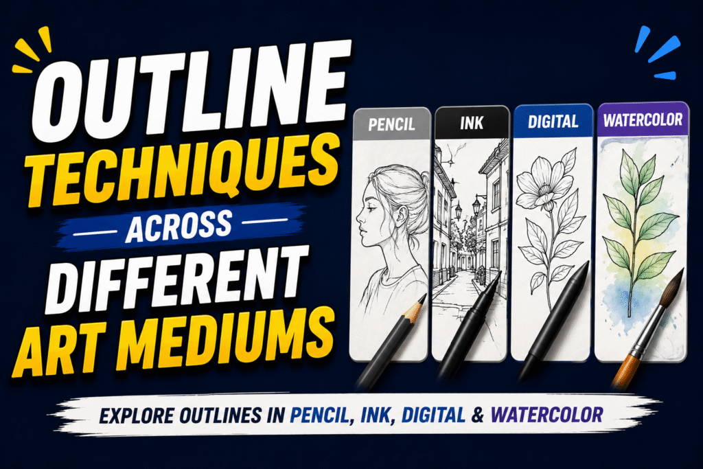
The concept of outline in art stays constant. The execution changes completely depending on your medium.
Pencil and Charcoal
Pencil gives you the most control over line weight — the harder you press, the thicker and darker the line. Beginners often press too hard too early, leaving grooves in the paper that can’t be erased.
A better approach: build your sketch outline lightly first (construction lines), then commit to your final edges with confident, varied pressure. The side of a pencil can create beautiful soft implied outlines — edges that suggest form without hard definition.
Ink and Pen
Ink is the medium that teaches commitment fastest. There’s no undoing it.
Working in ink forces you to decide before you draw — which builds the kind of deliberate confidence that pencil work can sometimes allow you to avoid. Crosshatching near an outline can imply shadow while keeping the edge clean.
Beginners’ most common ink mistake: outlining the entire composition in the same pen size. The result looks flat and equally weighted — like a coloring book page. Vary your tools or vary your pressure.
Oil and Acrylic Paint
Two legitimate schools of thought on outlines in painting:
- Outline first (underpainting) — sketch the composition in thin paint or pencil, then build color over it. Traditional and controlled.
- Outline last (refinement) — paint the masses and values first, then refine edges at the end. More spontaneous.
Neither is wrong. Both require understanding where edges should be sharp (foreground subjects, strong light) and where they should be soft (backgrounds, shadows, atmospheric depth).
The “dark halo” mistake is common in painted portraits: beginners instinctively outline the face in a dark color against a light background, creating an unnatural black border around the head. Real portraits have lost edges — areas where the hair or cheek dissolves into the background.
Watercolor
Watercolor edges are largely controlled by water — not by the brush. Wet paint on wet paper creates lost, blooming edges. Wet paint on dry paper creates hard, precise outlines.
Masking fluid lets you protect areas where you want a hard outline while painting loosely around them. Released after the paint dries, it reveals a crisp, clean edge. Useful for botanical illustration, where outline drawing precision matters.
Digital Art Outlines
Digital art outlines require understanding one fundamental distinction first:
| Type | What It Is | Best For |
|---|---|---|
| Vector outline | Mathematical paths — infinitely scalable | Logos, icons, character design sheets |
| Raster outline | Pixel-based — resolution dependent | Paintings, textured illustrations, concept art |
In Procreate, the standard workflow is:
- Sketch layer — rough gesture drawing and proportion
- Ink/Line layer — clean outline drawing with a Studio Pen or similar
- Color layers (below the line layer, using clipping masks)
Variable pressure brushes that respond to Apple Pencil pressure replicate line weight variation naturally — and this is what separates polished digital line art from flat, mechanical-looking output.
Printmaking
Woodblock prints — think Hokusai’s The Great Wave — have bold, characteristic outlines because the cutting tool forces you to simplify. You can’t cut delicate hairlines in wood. The result is outlines with inherent visual weight and bold confidence.
Understanding this helps when you want to replicate that outline illustration aesthetic digitally: go thicker, go bolder, simplify more than feels natural.
Famous Artists Who Used Outline as a Weapon
These artists didn’t just draw outlines. They made outlines say something.
Aubrey Beardsley (1872–1898)
Beardsley’s Art Nouveau ink illustrations used sinuous, erotic, psychologically charged expressive outlines. His lines were never neutral. Every curve implied something. Lesson: an outline carries mood — choose its character deliberately.
Roy Lichtenstein (1923–1997)
Lichtenstein borrowed the thick outlines and Ben-Day dot patterns of commercial comic printing and placed them in gallery contexts. The outline became the subject of commentary. Lesson: context transforms how an outline is read.
Egon Schiele (1890–1918)
Schiele’s figure drawings feature jagged, anguished contour lines that feel almost painful to look at. His outlines aren’t describing bodies — they’re describing psychological states. Lesson: line quality is emotional quality.
Katsushika Hokusai (1760–1849)
In Ukiyo-e woodblock printing, Hokusai treated the outline drawing as the architecture of the entire composition. Every line in The Great Wave is precisely weighted to direct the eye. Lesson: outlines are compositional tools, not just descriptive ones.
Jean-Michel Basquiat (1960–1988)
Basquiat used raw, childlike outlines as a deliberate rejection of academic polish. His figures look scrawled — but the scrawl is precise in its intention. Lesson: a “broken” or rough sketch outline can carry more power than a perfect one.
Bill Sienkiewicz (b. 1958)
Sienkiewicz revolutionized comic art by dissolving outlines entirely in places — letting forms bleed into backgrounds, mixing media, destroying the hard edge. Lesson: knowing when not to outline is as important as knowing how.
Outline in Digital Art and Modern Design
The digital art outline has become the backbone of entire visual industries.
In UI/UX design, icon outlines must remain legible at 16px and 512px simultaneously. That demands outline decisions made at an architectural level — clean paths, consistent stroke weights, no visual noise.
In animation, character design pipelines at studios like Pixar and DreamWorks include a dedicated “outline pass” — a stage where animators review and refine character edges before color and lighting are applied. The outline is literally a production stage.
In tattoo art, the bold outline isn’t optional. Skin ages, stretches, and blurs over time. A tattoo with weak outlines loses definition within years. Bold, clean outline drawing is the non-negotiable foundation of any tattoo designed to last.
In brand identity, consider that the most recognizable logos in the world — Nike, Apple, Mercedes — reduce to a pure silhouette in art. No color, no gradient, no detail. Just the outline. If a logo can’t survive as a pure outlined shape, it’s not strong enough.
The chunky outline aesthetic has dominated social media illustration, streetwear, and contemporary graphic design since roughly 2022 — bold black outlines, flat fills, minimal shading. It’s a direct descendant of comic art and Japanese manga, filtered through digital tools and internet visual culture.
Common Mistakes Artists Make with Outlines
Be specific about what goes wrong — that’s where the real learning happens.
1. Uniform line weight throughout Every line the same thickness = flat, lifeless work. Vary your weight. Always.
2. The “coloring book” digital outline outline meaning in art a digital illustration on a separate layer and filling color beneath it with zero attention to edge quality produces a result that looks like a coloring book page. Adjust opacity, vary stroke, and consider where outlines should fade or disappear.
3. Copying the outline from a photo reference exactly Photo tracing trains your hand but not your eye. You learn to copy, not to observe. Use references to understand form, then draw from that understanding.
4. Ignoring lost edges Over-outlining every single edge in a composition kills atmospheric depth. The background shouldn’t have the same outline weight as your focal point. Let some edges breathe.
5. Using outline to rescue bad proportions An outline should describe a correctly proportioned form, not try to correct a badly constructed one. Fix the structure first. Then outline.
6. Inconsistent outline style within one piece Mixing sharp geometric outlines and loose gestural ones in the same image — without intent — looks accidental. Make a stylistic decision and commit to it.
7. Confusing construction lines with finished outlines Structural scaffolding lines help you build a drawing. They’re not the final outline. Clean them up before committing to your final drawing outlines.
How to Practice and Improve Your Outlines
Deliberate practice beats random drawing every time. Here’s a structured approach.
Daily Exercises
- 10-minute gesture drawing focusing on silhouette only — capture the outer shape, nothing inside. Try Line of Action for timed pose references
- Single-line drawing — draw an entire object without lifting your pen. Forces commitment and improves line confidence
- Negative space drawing — draw the space around an object rather than the object itself. This retrains your eye to see outlines as boundaries, not objects
Deliberate Skill Drills
- Line weight scales — draw a 10-step scale from hairline to maximum bold. Do this before every drawing session, like a musician running scales
- Blind contour drawing three times per week minimum. Yes, it looks terrible. Do it anyway
- Copy master drawings focusing only on line quality — not shading, not values. How did Dürer vary his weight? How did Hokusai simplify an edge?
Study Recommendations
| Artist | What to Study |
|---|---|
| Hokusai | Compositional line hierarchy |
| Egon Schiele | Expressive edge variation in figures |
| Jack Kirby | Line weight for visual power |
| Aubrey Beardsley | Decorative outline as mood |
| Any manga artist | Clean, efficient contour outline technique |
Tools Worth Trying
Traditional:
- Staedtler Pigment Liner — consistent, waterproof, reliable
- Pentel Pocket Brush Pen — variable line weight through pressure
- Faber-Castell PITT Artist Pens — excellent range of tip sizes
Digital:
- Procreate: Studio Pen (inking), 6B Pencil (sketching)
- Photoshop: Kyle Webster’s Ink brushes (free with Creative Cloud subscription)
- Illustrator: Blob Brush for organic outlines, Pen Tool for geometric precision
Outline in Art Education — Why Teachers Always Start Here
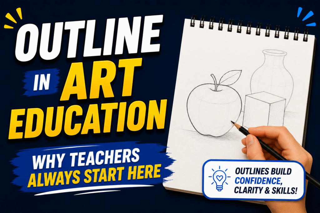
There’s a reason every beginner drawing guide starts with line, and every art fundamentals course opens with outline drawing exercises.
It’s the simplest bridge between looking and making. Before a student can understand value, perspective, or color relationships, they need to translate what they see into a mark. The outline meaning in art is that translation — stripped of everything except the essential decision: where is the edge?
The Bauhaus school (founded 1919, Germany) formalized this approach. Their foundational course taught line as the primary element of visual design — before color, before texture, before material. The idea: if you can’t describe a form with a line, you don’t yet understand the form.
Blind contour drawing is the most universally assigned exercise in art education because of what it trains neurologically. It forces students to look instead of symbolize. Most beginners draw what they think a hand looks like — five sausage shapes attached to a palm. Blind contour forces them to follow the actual, specific, irregular edge of a real hand. The drawing looks wrong. The seeing becomes right.
For children, outline meaning in art-based activities develop fine motor skills, hand-eye coordination, and spatial reasoning simultaneously. That’s why coloring books and tracing exercises appear in early childhood education — they’re using the outline’s pedagogical power, even if educators don’t always name it that way.
ALSO READ: IDT Meaning in Text The Ultimate 2026 Guide to This Viral Chat Slang Everyone Misreads
Real-World Outline Examples in Action
Theory is only useful when you can see it working in the real world.
Tattoo Art
The bold outline in tattoo art isn’t aesthetic preference — it’s structural necessity. Skin changes. Over 10–20 years, ink migrates slightly, causing fine-line details to blur together. A strong outline drawing creates the armature that holds the design together even as the inner details age. Thin-line tattoos that look beautiful fresh often become muddy after a decade. Bold outlines don’t.
Logo Design
Nike. Apple. Mercedes-Benz. The world’s most enduring logos survive as pure silhouette in art. No color, no gradient, just the outline. A logo that requires color to be recognizable is a logo with a weak outline meaning in art foundation. Strong logos start as outline sketching exercises — and they stay strong at any size.
Animation
Disney’s animators — the legendary “Nine Old Men” — used line weight variation to encode character personality into their outlines. Heroic characters had bold, upward-sweeping outlines. Villains had sharp, angular, downward-pressing ones. The outline told you who to root for before a single word of dialogue.
Medical and Scientific Illustration
In medical illustration, outline drawing accuracy is literally a matter of patient safety. Anatomical diagrams must convey precise spatial relationships between structures — which vessel runs above which nerve, how organs overlap. The contour outline cannot be impressionistic here. It must be exact.
Street Murals
A mural viewed from 50 feet behaves completely differently from an illustration viewed at arm’s length. Street artists know this: their outline design choices must account for the viewing distance. Thick, bold outlines carry across distance. Fine detail disappears. The best muralists design their outlines for the specific space — a concept called site-specific line weight.
Graphic Novels
Chris Ware’s architectural outline illustrations in Building Stories use cold, precise, uniform outlines throughout — deliberately. That mechanical consistency creates emotional distance, which is exactly the psychological effect Ware intends for stories about isolation and disconnection. The outline style is the emotional content.
The Line That Holds Everything Together
Here’s the truth most art guides won’t tell you: the outline never stops mattering. Beginners need it to learn. Intermediates need it to communicate. Masters need it to express.
Every painting, illustration, print, digital artwork, or tattooed design you’ve ever found beautiful had edges that someone thought carefully about. Lines that were chosen — not just defaulted to. Weights that were varied with intention. Places where the outline meaning in art was deliberately lost, and places where it was made bold and certain.
Outline meaning in art isn’t a beginner concept. It’s a foundational one. The deeper you go into any art form, the more you return to the same question: where is the edge, and how do I mark it?
ALSO READ: CYA Meaning in Text Ultimate Guide You Need to Know 2026
FAQs
What is outline meaning in art?
outline meaning in art refers to the line that defines the outer edge of a shape or form, separating it from the surrounding space. It’s the most fundamental mark-making concept in all of visual art.
What is the difference between outline and contour line in art?
An outline traces only the outer boundary of a subject — its silhouette. A contour line maps both exterior and interior edges, capturing surface details like folds, creases, and overlaps.
Why is outline important in art?
Outline gives a subject definition, clarity, and visual presence. Without it — explicit or implied — shapes lose their identity and compositions become difficult for the viewer’s eye to read.
What are the main types of outlines used in art?
The most common types include geometric outline, organic outline, gestural outline, implied outline, broken outline, and lost-and-found outline — each serving a different expressive or compositional purpose.
How do beginner artists practice outlines effectively in 2026?
Blind contour drawing, single-line exercises, and daily gesture drawing on platforms like Line of Action remain the most effective and widely recommended practice methods for building strong outline skills.
conclusion
Understanding outline meaning in art transforms how you create. The outline isn’t just a border — it’s a decision. It carries weight, emotion, and intention. Every great artist, from Hokusai to Basquiat, mastered the edge before anything else. So should you.
Start simple. Pick up a pen and draw one object using pure outline. No shading, no color — just the line. That single practice will teach you more than hours of unfocused drawing. Outline meaning in art is where everything begins. Master the line, and everything else follows.
Hi! I’m Jenson, the writer behind punslush.com. I craft clever puns and witty wordplay designed to entertain and inspire. Visit punslush.com for a good dose of humor and fun!